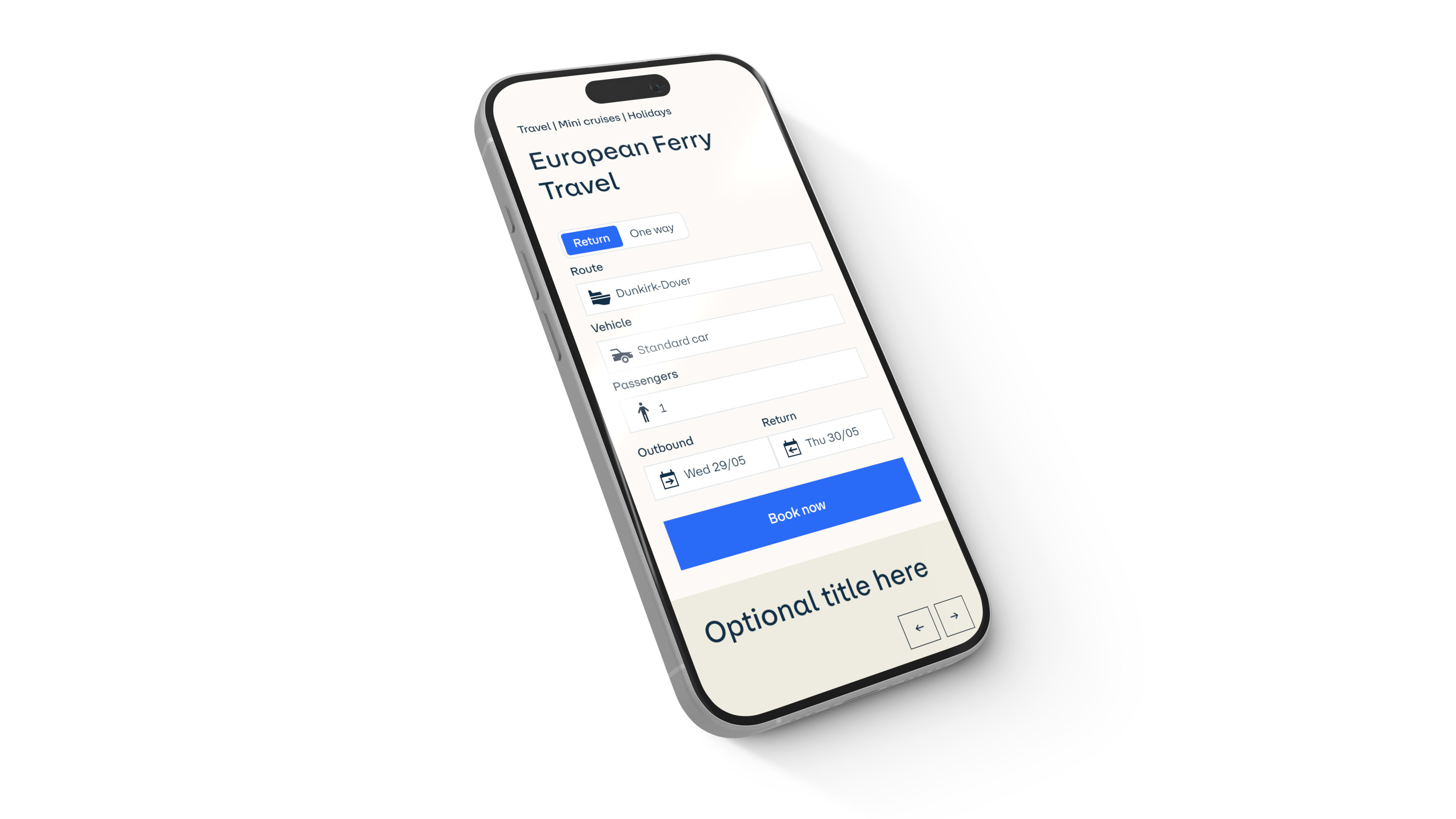
Building a Scalable Design System in 4 Months

We delivered a bespoke design system in just four months using Figma and shadcn/ui, tailored to the client’s rebranding needs. The system reduced production build times by over 90%, enabled same-day marketing page creation without developer input, and streamlined collaboration to improve time-to-market and consistency across 200+ pages.
Introduction
To remain competitive and meet the evolving needs of their customers, a leading European company with over 150 years of history embarked on a digital transformation to modernize their digital presence and improve collaboration across teams.
Challenge
As part of a rebranding initiative, the client needed to unify their digital platforms under a cohesive, scalable design system. Beyond creating reusable components, the initiative required aligning cross-functional teams to ensure consistent implementation of their refreshed brand identity across all touch points. The client also needed a solution that reduced complexity, accelerated delivery timelines, and positioned their digital ecosystem for future growth.
Our approach
Creating reusable components and content models
We began with an audit of over 200 product and marketing pages, distilling the structure into eight core page archetypes. This simplification allowed us to identify and define the most critical reusable components for their business, creating a streamlined design system that ensured consistent customer experiences.
Leveraging the client’s existing Contentful setup, we established a new instance with scalable content models that eliminated redundant content types. This reduced complexity, decreased API queries, and lowered associated costs.
Each component was built to be compatible with performance-optimized elements like Next.js’s next/image and next/link, as well as fallback HTML standards. This approach ensured the components could be reused in apps built on varying frameworks, minimizing future rework and supporting long-term flexibility.
Tokenizing designs for scalability
We implemented design tokens across the design and development workflow to enhance scalability and maintainability. This allowed for seamless updates and theming adjustments across platforms.
To upskill the client’s design team, we provided embedded collaboration and tailored Figma Variables training. These sessions introduced responsive design principles, atomic design practices, and efficient handoffs, enabling designers to create robust documentation that improved workflow alignment and ensured 1:1 parity between design and development libraries.
Building a bespoke design system without starting from scratch
The client sought an off-the-shelf component library but found existing options like Material UI and NextUI too rigid and inflexible for controlling critical design elements. They needed a solution that offered customizability, scalability, and speed.
We utilized shadcn/ui, an open-source library of React components designed for full customization and accessibility. Its tokenized structure and flexible theming capabilities allowed the client to modify existing designs or create new ones without a complete design system overhaul.
To support the client’s goals, we provided our open-source Figma UI kit, containing the latest shadcn/ui components and a custom Figma plugin that synchronized design tokens with their codebase. This streamlined workflow aligned design and development teams, minimized handoff errors, and accelerated delivery timelines.
Our open-source Figma plugin syncs semantic tokens across Figma design files and code repositories. Designers can preview in Figma how updates to design tokens impact UI/UX in production. The plugin generates Tailwind CSS classes, creates pull requests, and triggers automated tests and preview builds, enabling teams to review and share updates effortlessly.
Tracking design system adoption
To monitor adoption and track component usage across applications, we implemented Radius Tracker, an open-source tool that provides real-time insights into component consumption. This allowed the client to identify underutilized components, uncover adoption barriers, and iterate continuously based on feedback.
Managing organizational complexity
Given the simultaneous redesign of product pages and the design system, we ensured our momentum wasn’t dependent on product-specific progress. We balanced creating the system’s rules with adapting to product requirements, guiding designers to think holistically about both the design system and product requirements.
Fostering cross-functional collaboration
To unify the client’s design and development teams, we embedded cross-functional feedback loops and enabled real-time collaboration.
- Vercel deployment previews: Allowed designers to review components as they were developed and provide immediate feedback. This approach minimized revisions and helped both teams stay aligned, significantly speeding up the design-to-development process.
- Figma-embedded feedback: Enabled developers to clarify design details directly within Figma, ensuring seamless handoffs.
Automated testing and improving CI/CD pipelines
We shifted quality assurance earlier in the development cycle by testing components in a sandbox Contentful instance and a demo application during development. This approach accelerated problem resolution and reduced risks associated with late-stage testing.
The demo app acted as living documentation, allowing stakeholders to see components in action with real content, improving usability testing and accessibility validation. Unlike Storybook, our demo app provided real-time, interactive documentation with actual content, significantly improving usability testing and stakeholder buy-in.
We also optimized the CI/CD pipeline, reducing production build times by 90% (from 10+ minutes to under 1 minute) and local build times by 98% (from 5 minutes to 7 seconds). Automation scripts for component generation, story creation, and accessibility testing further standardized workflows, reduced repetitive tasks, and expedited prototyping.
Results
Within four months, we successfully implemented a scalable design system tailored to their rebranding and operational needs:
- Delivered 35+ reusable components across 200+ product and marketing pages;
- Reduced production build times by 90%, enabling faster feature releases and market responsiveness;
- Achieved same-day marketing page creation without developer input; and
- Accelerated design-developer handoff and time-to-market through enhanced collaboration between teams.
Conclusion
In just four months, the client transformed their digital ecosystem with a bespoke, scalable design system that reduced complexity, streamlined workflows, and fostered cross-functional collaboration. With a clear governance model, real-time design system adoption tracking, and automated tools, the client is well-equipped to efficiently manage and scale their design system while supporting their corporate rebrand across digital platforms. This scalable system allows them to quickly adapt to changing digital demands, aligning their operations with a focus on efficiency and delivering improved customer experiences.